My blog has moved!

You will be automatically redirected to the new address. If that does not occur, visit
http://www.modernbohemian.ca
and update your bookmarks.

It's all about the pillows...


I love pillows…

I love their coziness, their luxurious voluptuousness and the possibilities of beauty and comfort they provide. It may have to do with the word “pillow” itself…what do you think of when you hear it? Big, soft, fluffy pillows piled on top of your bed; piles of gorgeous pillows in fabulous colours and textures on a deep-seated sofa…perfect for reading or napping on a cold, rainy day. Or perhaps it is the pillowy hug from the woman you love or the mother who held you when you were tired or sad.

Wherever you find the word “pillow” it is usually associated with comfort. I have always carried my pillow (or “pullump”, as the five-year-old Aussie kid in me says) on any trip, be it a short road trip or a fifteen hour flight across the Pacific Ocean.

As a little girl, when my dad would come home from work he would call out “get your pullump Christine, we’re going to Queensland!” Oh the heaven of it! A huge pile of pillows and blankets in the back of the van and a thousand mile drive ahead of us. Too bad I had to share it with my two little brothers - but that’s another story.

Then there was the bliss of being wrapped in the loving, pillowy bosom of my nanna when we finally arrived in Queensland and climbing into a bed that was encircled by a "romantic” mosquito net and made up in clean, white, cotton sheets and pillows. One of my daughter’s few memories of my dad includes bringing her pullump into bed with him and nanna for a morning snuggle.

I have this huge collection of of gorgeous fabric and vintage blankets that just keeps expanding; spilling off the shelves, into drawers, out of drawers; piling up in corners…

So when I asked myself the question “what do I want to do?” I thought…”I want to make pillows.” I will make beautiful pillows to make people happy.

Tuesday 9 April 2013

Chiaroscuro...... black and white fabulous..... .

One of my favorite color schemes is Chiaroscuro or shades of black, gray, creme and white.  I am thinking of crisp black and white ticking pillows on a white linen sofa, faded ink stenciled on old wooden shop signs, faded black and white toile curtains or even the crisp beauty of a Swedish seaside cottage stained with that ubiquitous black stain and then trimmed in crisp white. 

I love the way the color scheme works with old metal, glass wear and wicker.  I usually stick to interiors but couldn't resist this image of a pair of fabulous black and white stripe palazzo pants and fabulous sandals and gotta love the grey nail polish...... very chic.  If I had another life it would be in a chic black and white house with no color at all, it obviously won't be this life because I love color too much, but if there is another go around..... maybe.

Isn't this stunning, love the New Yorker print too.


Love the Scandinavian vibe here, especially the old weathered wood beach chair with the crisp new ticking cover.


blackktichen.jpg
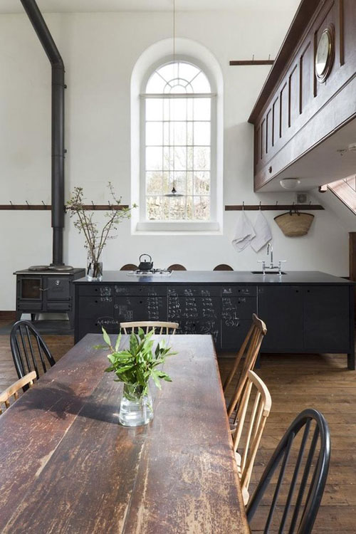
This looks to me like a refurbished church or school, love the black and white with the worn wood.
Fabulous vista. I love this glimpse of that black dresser through those fabulous doors and a glimpse of a grey linen pillow in the foreground.
I wish I could do this, and resist putting color in there.
I wish I had styled this, I wish I owned this, I want to see this image every day in my house.
Can't you just imagine the snow piled up outside and curling up here in front of the fire.... and someone teaching me to knit.!
There is nothing I would change here, love the sleek, modern chair, fabulous ceiling fixture the warm rug and all the different black and white themes.
Chic, fabulous and sooooo comfortable looking.
OK, so hope that this snaps everybody awake ...... gotta love black and white fabulous!!

Christine

Wednesday 27 March 2013

Spring on Gabriola....


Vintage metal bike basket filled with spring colour beside the front door.

OK, how can you guess this is my favorite season of the year... and just as well I love yellow.  As daffodils are one of the few flowers that the deer don't eat, I have lots and they are naturalizing like crazy.  Here are some images of pots on my deck and my "very natural" garden, mixed in with some beautiful images from Pinterest including tulips.  Tulips are my absolute favorite
flower, and just because the deer won't let me have them in the garden doesn't mean I don't have them in the house all through February, March and April...

Ciao

Christine

Details of the above basket, a lacy fern, double primrose, tiny narcisus, an alpine tulip and a candlestick primula tucked in the back hiding from the deer.


This is a pot on the back deck filled with blue scilla, tiny narcissus and a variegated ivy.


Detail of the above, I have had this beautiful rusted ball for many, many years.


Pretty double primroses, a graceful grass, tucked into the moss in my favorite pot.

Looking across the "lawn" moss, daffodils amongst the native ferns.
This vase comes out in the spring to hold daffodils from the garden and dark blue anemones or hyacinth when I can find them.  The color is perfect for the vibrant spring blooms.
Orange Princess Tulip, gardening, landscaping, flowers
Orange Princess tulips..... oh how I wish I could grow these.
.
I love orange tulips and I love this room
Symbols of spring...
White crocus in a blue and white bowl..... heaven surely.
.
Fade to exquisite, white parrot tulips....

Riff on the Crate and Barrel ad for spring.


Indigo Composition
I love this on so many levels


What inspired me to do this post was a newspaper ad for Crate and Barrel in this Saturday's Vancouver Sun.

It was a picture of a kitchen, or a part of a kitchen and was lovely in the classic rustic, French way with polished stone floors, white plaster wall, freestanding fittings in stainless steel and timber and lovely rustic beams.  Now you can see this image a million times, a million ways, but what made it pop was the jolt of color in the middle of all the neutrals.  In this case it was an indigo blue painted wooden chair and a napkin and carafe with just a touch of that same blue.  Just a small amount of color but it made the image pop.... So I went looking for some more examples of this idea and here is what I found. I hope you enjoy and are inspired.

Christine


morocco..
so serene, calm and beautiful.... but then look at that fabulous chair and the lamp.


chalk blue lights...pine cupboard...i love it all!
Gorgeous neutral with a pop of color


Pastels
Such an interesting and dreamy color scheme.


???
Yep, its all about that gorgeous sofa

Thursday 7 March 2013

Want to be East - not West.....


This fabulous bedroom from another of my favorite blogs Belgian Pearls  belgianpearls.blogspot.ca  was what transported me this morning. From the grey and green of the west coast of British Columbia to "the idea" of another world somewhere east...

[003%255B5%255D.jpg]
Douglas Mackie via House & Garden August 2012
But then really this room could be anywhere. There are so many influences here.  Quite honestly it was the Suzanni textile used as a throw on the bed that did it for me at first, but then there is that tile floor and an actual window over the bed , which makes me think that it is French for some reason.  But then you look at those fabulous light sconces and the rug on the floor and I want to think it is in Marrakesh or somewhere exotic and beautiful.  But the wallpaper, beams and and Chinese chest, not to mention that big white radiator make me think that this is probably the bedroom of some well traveled Brit or Scot.  

Where ever it is - it is heaven and I want to live in this room.....

So that's done it for me. I am now lost in a world of beautiful exotic textiles and my plans of creating pillows with appliqued sail boats is going right out the window ......  I will post pictures of whatever comes out of today's textile exploration.

Explore and enjoy your day...
Christine

source:wabisabi-style.blogspot.ca
Kuba Cloth, love the exposed stitching

S10
source: Pottery Barn catalogue

Tuesday 5 March 2013

Out of the blue inspiration finds us......


I clicked on one my favorite blogs this morning and what did I find but beauty, inspiration and a antidote for a grey, gloomy west coast day. My French Country Home at http://myfrenchcountryhome.blogspot.ca is one of my favorite blogs and Sharon Santoni did not disappoint me today, in fact she made my day...


I felt compelled to group these images together and am wondering why.... I think it has a lot to do with the pale washed out blues and a little bit of pink, that is making me think that spring is not too far away.  I would sell my soul for that blue and white coffee bowl in the picture with the pink roses.  I have seen that on Pinterest and am still hoping that will be mine one day.  And what is it about artist's tools that are so evocative?  Even their palettes and paint brush's seem to become works of art, and I don't believe it is just a messy coincidence. With most artists I know, their art is in every fiber of their being, even in their paint spattered jeans.

One of the pictures from Sharon's "loot shoots", I love this.

happiness


blue greyPreview "a girlfriend's home - so french and feminine" - Sharon Santoni
There's that blue.... love it with the wire work


.
I am adding this space to my wish lists of places to live...


 Enjoy everyone and pass it along...
Christine


Monday 4 March 2013

Beautiful stories and beautiful pictures.


Sometimes I can be drawn into a story by just one image, or sometimes it is even a word. This week is was the word Aalamwaar and the story is Aalamwaar Textiles. I am going to quote from the website here as they can explain their work better than I can.


"AALAMWAAR TEXTILES is a social enterprise that specializes in handmade clothing and home furnishings. Aalamwaar's priority is to preserve, document, sustain and promote traditional textile-making techniques in India. By employing grass-roots artisans, Aalamwaar aims to create livelihood for indigenous craftspeople and their families as well as to preserve hand-dyeing, hand-block printing, hand weaving and fabric-painting arts in India. Aalamwaar uses only natural fabrics, which are carefully sourced from NGOs and small producers throughout India. Empowering women by teaching them skills is one of our objectives" 

This beautiful word Aalamwaar has it's origins in the indigenous language of south India and has been synonymous with social enerprise in this family for many generations.Viji Reddy and her sister Archita Reddy are carrying the family tradition forward with the creation of Aalamwaar Textiles where their gorgeous textiles and accessories are made.  If you go to their beautiful website http://www.aalamwaar.com you can see for yourself what I am talking about.  

I found this website through a wonderful blog called An Indian Summer"  http://anindiansummer-design.blogspot.ca and all the images shown here are theirs.


It seems such an obvious thing that we support businesses like this where so much is gained  by empowering people to not only use their expertise to support themselves and their family, but to share with us the riches of their traditions and their beautiful work.  Enjoy and pass along...

Christine

Thursday 17 January 2013

Wabi Sabi...... Perfect Imperfection.


A sense of style..... what does that mean?
  
For me the Japanese phrase Wabi Sabi says it all .. "perfect imperfection".


When I think about stylish and beautiful interiors; and exteriors for that matter I am always drawn back to images that are softly worn and ever so slighted dilapidated.  I would also use the word "decayed" but unfortunately that word scares some people. 


Perfect imperfection.... as in everything you need in a kitchen, blending worn materials, function and beauty.   


That feeling I have for things that are as beautiful as they are useful. Think of an  old beach cottage anywhere in the world, with the flaking white shingles and pale blue painted shutters and trim. Or the softly, almost incandescent plaster walls of a French or Italian villa where the layers of chalk paint have worn away to create almost a fresco-ed effect.  

There is a sense of self assurance as well as that enigmatic sense of style, that comes with effortlessly combining old and new, quirky self indulgences with reverence for objects that show their age.
 
A perfect example of carrying this off is the blurring of the boundaries between inside and out.  I love seeing this done in any room. It is so much more interesting to see a beautiful old French Canadian kitchen chair warmly showing it's years of wear used as a bedside table; or a funky, metal patio table used as a side table next to a chair pulled up to the fireplace.  Who needs all sterile "built in" kitchen cabinets when you can have a dresser filled with crockery and glassware and a beautiful old wooden table piled high with all the "encroutement" of daily life ( please pardon my French if the spelling is not correct).  


Here are two stunning examples of just that confidence and style, pulling it off in spades.


But lets face it we do not all live in a converted barn in the south of France or a seaside cottage on an island in Sweden so we have to re-create the ambiance for ourselves. So we do what style savvy people have done through the ages, we  take what we can afford and mix it with what we know to be beautiful, blend it with good practical use and we will come up with own own version of Wabi  Sabi .....


God I love a drinks cabinet....


There are a minimum of 6 re-purposed objects in this beautiful room not counting the structure itself..... sublime


Wabi Sabi ahhhhh.....


Decayed? ......... beautiful.


These beautiful images were courtesy of Pinterest....... of which I continue to be an addict.

Ciao for now

Christine